MantisBT - VCMI |
| View Issue Details |
|
| ID | Project | Category | View Status | Date Submitted | Last Update |
| 0001113 | VCMI | Mechanics - Town structures | public | 2012-09-30 08:56 | 2018-01-27 13:09 |
|
| Reporter | Zamolxis | |
| Assigned To | FeniksFire | |
| Priority | normal | Severity | feature | Reproducibility | always |
| Status | resolved | Resolution | fixed | |
| Platform | | OS | | OS Version | |
| Product Version | | |
| Target Version | | Fixed in Version | 1.next | |
|
| Summary | 0001113: WoG feature request: Buy All Available Troops |
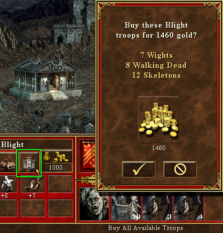
| Description | Could you please implement in one of the next releases the "Buy All.." function from WoG (using the small Castle icon in Town screen for it)? See screenshot: purchase priority given to the higher rank creatures, as much as available gold allows.
Most of the time I need to buy all anyway, and it would make a huge difference being able to do it in just 2 mouse clicks, as opposed to up to 23 clicks now (for all 7 creatures, and all clicks on different area of the screen). It would help me a lot as a tester, in cases when I just need to buy enough troops to win a certain battle, when I do reproducibility tests related to that. |
| Steps To Reproduce | |
| Additional Information | |
| Tags | No-harm enhancement |
| Relationships | |
| Attached Files |  2012-09-30_H3BuyAll.jpg (123,017) 2012-09-30 08:56 2012-09-30_H3BuyAll.jpg (123,017) 2012-09-30 08:56
https://bugs.vcmi.eu/file_download.php?file_id=1113&type=bug
 2012-10-01_RecruitAllSuggestion1.jpg (45,392) 2012-10-01 10:58 2012-10-01_RecruitAllSuggestion1.jpg (45,392) 2012-10-01 10:58
https://bugs.vcmi.eu/file_download.php?file_id=1128&type=bug
 2012-10-01_RecruitAllSuggestion1-Dungeon.jpg (49,374) 2012-10-01 10:58 2012-10-01_RecruitAllSuggestion1-Dungeon.jpg (49,374) 2012-10-01 10:58
https://bugs.vcmi.eu/file_download.php?file_id=1129&type=bug
 2012-10-01_RecruitAllSuggestion2.jpg (45,035) 2012-10-01 10:58 2012-10-01_RecruitAllSuggestion2.jpg (45,035) 2012-10-01 10:58
https://bugs.vcmi.eu/file_download.php?file_id=1130&type=bug
 2012-10-01_RecruitAllSuggestion2-Dungeon.jpg (48,784) 2012-10-01 10:59 2012-10-01_RecruitAllSuggestion2-Dungeon.jpg (48,784) 2012-10-01 10:59
https://bugs.vcmi.eu/file_download.php?file_id=1131&type=bug
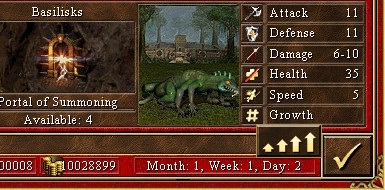
 2012-10-01_RecruitAllSuggestion3-Dungeon(wip).jpg (48,750) 2012-10-01 11:39 2012-10-01_RecruitAllSuggestion3-Dungeon(wip).jpg (48,750) 2012-10-01 11:39
https://bugs.vcmi.eu/file_download.php?file_id=1133&type=bug
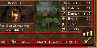
 2012-10-01_RecruitAllSuggestion4-Dungeon(wip).jpg (48,850) 2012-10-01 11:39 2012-10-01_RecruitAllSuggestion4-Dungeon(wip).jpg (48,850) 2012-10-01 11:39
https://bugs.vcmi.eu/file_download.php?file_id=1134&type=bug
|
|
| Issue History |
| Date Modified | Username | Field | Change |
| 2012-09-30 08:56 | Zamolxis | New Issue | |
| 2012-09-30 08:56 | Zamolxis | File Added: 2012-09-30_H3BuyAll.jpg | |
| 2012-09-30 08:57 | Zamolxis | Tag Attached: No-harm enhancement | |
| 2012-09-30 09:32 | Ivan | Note Added: 0003127 | |
| 2012-09-30 09:53 | Ivan | Note Edited: 0003127 | bug_revision_view_page.php?bugnote_id=3127#r1958 |
| 2012-09-30 09:53 | Warmonger | Note Added: 0003129 | |
| 2012-09-30 09:58 | Ivan | Note Added: 0003131 | |
| 2012-09-30 10:49 | Zamolxis | Note Added: 0003134 | |
| 2012-09-30 10:51 | Zamolxis | Note Edited: 0003134 | bug_revision_view_page.php?bugnote_id=3134#r1960 |
| 2012-09-30 11:46 | Ivan | Note Added: 0003138 | |
| 2012-09-30 13:32 | Zamolxis | Note Added: 0003140 | |
| 2012-09-30 13:33 | Zamolxis | Note Edited: 0003140 | bug_revision_view_page.php?bugnote_id=3140#r1964 |
| 2012-09-30 13:34 | Zamolxis | Note Edited: 0003140 | bug_revision_view_page.php?bugnote_id=3140#r1965 |
| 2012-09-30 13:44 | Ivan | Note Added: 0003142 | |
| 2012-09-30 14:01 | Zamolxis | Note Added: 0003143 | |
| 2012-10-01 10:57 | Zamolxis | Note Added: 0003151 | |
| 2012-10-01 10:58 | Zamolxis | File Added: 2012-10-01_RecruitAllSuggestion1.jpg | |
| 2012-10-01 10:58 | Zamolxis | File Added: 2012-10-01_RecruitAllSuggestion1-Dungeon.jpg | |
| 2012-10-01 10:58 | Zamolxis | File Added: 2012-10-01_RecruitAllSuggestion2.jpg | |
| 2012-10-01 10:59 | Zamolxis | File Added: 2012-10-01_RecruitAllSuggestion2-Dungeon.jpg | |
| 2012-10-01 11:00 | Zamolxis | Note Edited: 0003151 | bug_revision_view_page.php?bugnote_id=3151#r1987 |
| 2012-10-01 11:37 | Zamolxis | File Added: 2012-10-01_RecruitAllSuggestion3-Dungeon(wip).jpg | |
| 2012-10-01 11:37 | Zamolxis | File Deleted: 2012-10-01_RecruitAllSuggestion3-Dungeon(wip).jpg | |
| 2012-10-01 11:39 | Zamolxis | File Added: 2012-10-01_RecruitAllSuggestion3-Dungeon(wip).jpg | |
| 2012-10-01 11:39 | Zamolxis | File Added: 2012-10-01_RecruitAllSuggestion4-Dungeon(wip).jpg | |
| 2012-10-01 11:45 | Zamolxis | Note Edited: 0003151 | bug_revision_view_page.php?bugnote_id=3151#r1988 |
| 2012-10-01 11:54 | Zamolxis | Note Edited: 0003151 | bug_revision_view_page.php?bugnote_id=3151#r1989 |
| 2012-10-01 12:01 | Zamolxis | Note Edited: 0003151 | bug_revision_view_page.php?bugnote_id=3151#r1990 |
| 2012-10-01 12:03 | Zamolxis | Note Edited: 0003151 | bug_revision_view_page.php?bugnote_id=3151#r1991 |
| 2012-10-02 14:29 | Ivan | Note Added: 0003157 | |
| 2013-03-14 23:40 | Fnord | Note Added: 0003457 | |
| 2018-01-27 13:09 | Dydzio | Note Added: 0007385 | |
| 2018-01-27 13:09 | Dydzio | Status | new => resolved |
| 2018-01-27 13:09 | Dydzio | Fixed in Version | => 1.next |
| 2018-01-27 13:09 | Dydzio | Resolution | open => fixed |
| 2018-01-27 13:09 | Dydzio | Assigned To | => FeniksFire |
|
Notes |
|
|
(0003127)
|
|
Ivan
|
2012-09-30 09:32
(edited on: 2012-09-30 09:53) |
|
If all you need is a huge army something like vcmiainur should work :)
What I don't like in most of WoG interface additions is that they're hard to notice. Clicking fort icon to buy all creatures? What's the logic behind that? Lack of "this-is-button" feedback is also annoying.
But I do agree that 23 clicks is too much. Maybe tweak recruit dialog and have slider set to max when dialog is opened?
This will give one less click per creature + you can press Enter to immediately buy creatures.
>> and all clicks on different area of the screen
Do you know that you can use creature icons instead of fort screen\dwellings?
|
|
|
|
|
|
Adding some more buttons (like the one that opens Commander screen) shouldn't be a problem if you use crowdsourcing ;) |
|
|
|
(0003131)
|
|
Ivan
|
|
2012-09-30 09:58
|
|
I think I can find empty button and draw text in runtime or find something acceptable for "buy all" function.
But where should I place it? Town screen interface is already full - no empty place at all for new elements :( |
|
|
|
(0003134)
|
|
Zamolxis
|
2012-09-30 10:49
(edited on: 2012-09-30 10:51) |
|
@Ivan (reply to both your notes):
1. I'm indeed not yet used to VCMI cheat codes... I guess I should practice, so thanks for reminding me. :)
2. What I said in description was just the more frequent scenario. It could happen that it's relevant for my test I use the town creatures, so cheat code won't always be a solution.
3. On the long term a solution to avoid the 23 clicks remains a need for regular players anyway.
4. What they made in WoG to make it a bit easier to notice, was to change the subtitle at hover-over, from "Castle" to "Buy All Available Troops", which I think it already helps.
5. I think it's very logic they used the Fort icon for it. What do you do in fact otherwise: Click on Fort building in town, then 21 clicks to recruit the creatures (even 24 at Dungeon or if certain 8th creature feature is enabled in WoG), then click again to close it. So using the Fort icon does kind of the same, but skips the 21/24 clicks in between.
6. Lack of "this-is-button" feedback is a minus, but it doesn't really annoy me, given the time it saves me. And I guess it's not something impossible to develop... just maybe not worth the time.
7. Tweaking the recruit dialog to default on max is a start, but then I also suggest the following:
- Swap the scroll button functionality, as right now it's counter-intuitive: if I scroll up, it actually reduces the number (most will link "up" intuitively with an increase, even more suggested by the MAX button there, where the increasing arrows, give the max of creatures)
- This change will also render the MAX button pretty useless, so maybe its functionality should change to swapping between MIN (0) and MAX whenever it is actioned
8. The tweak you suggest would only reduce the player actions (click or enter) from 21 to 14 (+2). Maybe adding the MAX button directly into the Fort interface would be even more helpful, by reducing that to 1 click (+2 = open Fort + confirm Buy All). I'll have to see where it's best to place it (given the occasional 8 creature cards situation) and post a screenshot here later on.
(this of course can be done in parallel with your MAX-default tweak, which would still be useful when we want to recruit only a couple of specific creatures)
9. I didn't know that we can use the creature icons (maybe I've seen a mention of it when you implemented, but if I didn't use it, I forgot). Is it in the manual? I'll check and let WM know in case it's not. Thanks for pointing it out! :)
10. A "Buy All" button, if small enough, could be placed just below the creature icons, on the extreme left of the subtitle bar (we never have a subtitle that wide to take the whole bar anyway). The only mention I would make if you go for this solution, is that there are WoG players already very used with the Fort icon, so they might still want the functionality kept there as well (aside from me, I think it was either Fnord, or GrayFace, or Valery/Salamandre who pointed that out once... either on our forum, or on the VCMI thread at Celestial Heavens - can't remember)
|
|
|
|
(0003138)
|
|
Ivan
|
|
2012-09-30 11:46
|
|
>> maybe its functionality should change to swapping between MIN (0) and MAX whenever it is actioned
Not sure. In H3 players got habit to press "max" and then immediately "buy" buttons - I'd rather keep functionality as it to avoid confusion.
>> The tweak you suggest would only reduce the player actions (click or enter) from 21 to 14 (+2).
Along with using icons instead of fort screen you can recruit all creatures in 1-2 seconds. Not one-click "buy all" but definitely an improvement.
Anyway "buy all" won't go into 0.90 so there is a lot of time to design better UI - there is no need to follow WoG _if_ we'll come with better solution. |
|
|
|
(0003140)
|
|
Zamolxis
|
2012-09-30 13:32
(edited on: 2012-09-30 13:34) |
|
>> Not sure. In H3 players got habit to press "max" and then immediately "buy" buttons - I'd rather keep functionality as it to avoid confusion <<
Good point. So you can ignore the suggestion on the MAX button.
>> Along with using icons instead of fort screen you can recruit all creatures in 1-2 seconds. <<
Maybe I'm missing something, but how can you use the icons to recruit 7 different creatures in 1-2 seconds? Isn't it still: click on 1st creature > MAX > Enter > click on 2nd creature > ...? That's 1-2 seconds per creature. If you make MAX as default, I think it would still take 5-7 seconds to recruit all 7.
>> Anyway "buy all" won't go into 0.90 so there is a lot of time to design better UI <<
Agreed. It wasn't a request for .90, but it would be nice if we can have at least in a few months from now (i.e.: .91).
BTW, there's another argument that makes the use of the Fort icon acceptable, *especially* now that creature icons can be used for individual recruit: the Fort icon is just next to the creatures in that window, and the creature icons don't have the "this-is-button" feedback either, so it's not like adding the function for the Fort will be out of place.
|
|
|
|
(0003142)
|
|
Ivan
|
|
2012-09-30 13:44
|
|
>> If you make MAX as default, I think it would still take 5-7 seconds to recruit all 7.
Maybe I'm too fast with mouse :)
click -> Enter -> move mouse a bit -> click ...
For me that's 3 seconds at most.
What about button in fort screen? This is how H4 and H5 handles this (one more button along with "Exit"). Resource bar may give some troubles but should be easy to solve. |
|
|
|
|
You must be mighty fast then... :-) I could do the "click > Enter > move mouse" sequence in 1-2 seconds, so multiplied by 7 that's at least 10 seconds for all creatures (not 3 clicks per creature, but still 3 actions). But if you can do 7 times that sequence in less than 3 seconds, I'm impressed... or one of us just got lost in translation here. :-)
Button in Fort screen is what I also suggested at no.8 above. I invent intend to come with a couple of graphic proposals, but as it's not for 0.90, it may not be today. |
|
|
|
(0003151)
|
|
Zamolxis
|
2012-10-01 10:57
(edited on: 2012-10-01 12:03) |
|
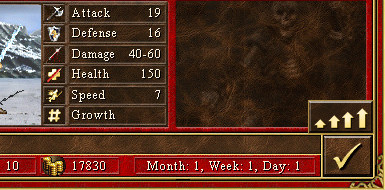
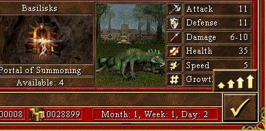
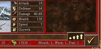
Please see my suggestions for a "Buy All Available Troops" button in Fort screen attached above:
Suggestion 1: Button above the Check button. IMO looks a bit better, but has the downside of overlapping Growth line in the 8th creature card. However the 8th creature card only rarely occurs (Dungeon and perhaps certain mods), and the Growth value is actually always 0/blank anyway, so the player is not missing any useful information.
Suggestion 2: Button left of the Check button. It overlaps the status bar, but maybe that doesn't look that bad - I'm not sure. The advantage is that it doesn't overlap the 8th creature card.
Let me know if you like any of them.
EDIT:
I thought of two other possibilities, but they might be harder to implement. They involve replacing the Fort-check button with the one from Town view (smaller), and then the Upgrade or Buy buttons above.
Suggestion 3: Using a 3-arrow cropped version of the MAX button (the 4-arrow was too wide to be aligned with the Check button). Or else we can use the 3-arrow Upgrade button, already existing, but that's narrower than the Check button below, so it may not look good. I just worry that the use of the 3-arrow Upgrade(-like) button may create confusion about its functionality, hence also the 4th suggestion below.
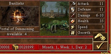
Suggestion 4: Using edited version of the BUY button graphics. I'm not sure if we can find the Buy button in this size in the game files (I thought there was one, but can't find it now). Here I overlapped its graphics over the other one, but I'm not sure if that's easy to do with the actual game files.
|
|
|
|
(0003157)
|
|
Ivan
|
|
2012-10-02 14:29
|
|
|
Suggestion 2 looks better BUT button should be made higher to have same size as exit button. This would need a bit smaller resource bar though. |
|
|
|
(0003457)
|
|
Fnord
|
|
2013-03-14 23:40
|
|
One other suggestion:
Create a new screen within the town screen just for special buttons.
Since there will likely be a number of town screen shortcuts or extra features in the future, either built right into VCMI, or in user-created mods, or in scripts, it would be very useful to have a whole new popup town screen devoted to this, ideally able to hold a couple of dozen new buttons (if multiple pages are possible, it could hold even more).
If you implemented this, you would need to find space on the regular town screen for only one button (perhaps even using the Fort icon) and then you'd have room for everything without having to worry about where to put it.
The drawback of course is one more button-click for "Buy All" but I think the advantages would outweigh this (assuming a new screen of special town buttons could be added this way).
As I expect this would take longer to code than just the "Buy All" itself (putting into the Fort or wherever), if that would delay the Buy All implementation then consider this more of a suggestion for later rather than sooner. |
|
|
|
(0007385)
|
|
Dydzio
|
|
2018-01-27 13:09
|
|
|
This is already implemented in daily builds. |
|